The famous Italian supercar maker, Lamborghini, has updated its logo after more than two decades.
Lamborghini’s new logo will be part of the brand’s new strategy which claims to reflect on "brave, unexpected and authentic" values helping to push towards a more sustainable and decarbonised future.
The change is part of the company’s plan to focus on becoming a more environmentally conscious company while producing vehicles that remain sought-after.
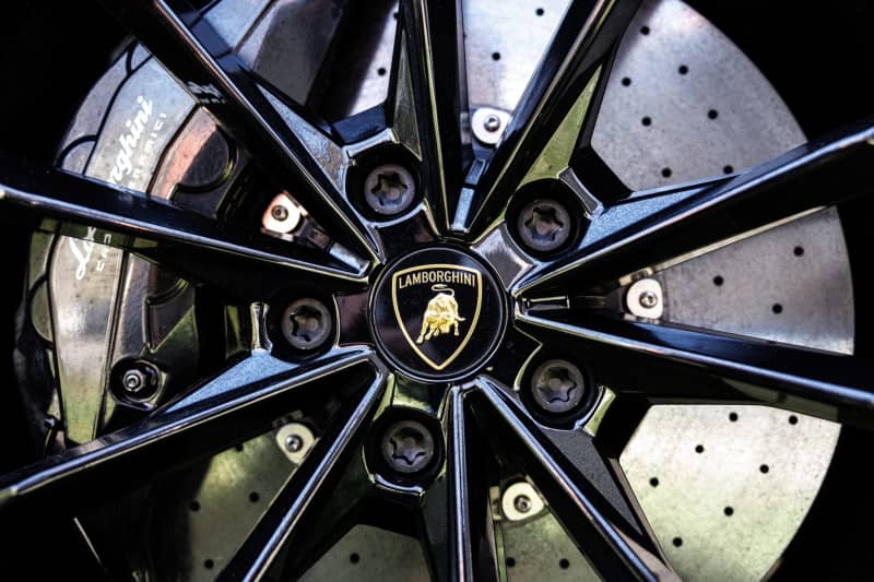
The new logo still incorporates the famous Lamborghini bull, but the colours used in the outline, the bull itself and the company name have been toned down to a more subtle black and white.
The black and white colours are used to symbolise the identity of the brand, while the yellow and gold act as the accent colour.
All future Lamborghinis will use the new logo, while the bull for the first time will be individually used for the company’s social media platforms.
The lettering is now broader and unlike the old style logo, there is no more of a 3D-effect look to it with the font called Automobili – a bespoke Lamborghini typeface.
Lamborghini is one of several carmakers that have switched to a ‘flatter’ style of logo. Fellow Volkswagen Group member Audi adopted a new version of its famous ‘rings’ logo back in 2022, while Renault redesigned its badge a year prior to that. More recently in June 2023, JLR unveiled a redesigned logo as a reflection of its wider rebrand.