Navigating the Roku home screen isn’t as straightforward as it used to be. While Roku still has the simplest streaming interface overall, it’s gradually becoming more complicated with extra menu cruft and new banner ads. Even Roku’s app grid, once a beacon of user-friendly design, is becoming filled with redundant shortcuts and content tiles.
Fortunately, you can still take a handful of steps to restore some of Roku’s hallmark simplicity. With just a couple minutes of setup, you can have a calmer, less-cluttered Roku home screen.
This story is part of TechHive’s in-depth coverage of the best media streamers.
Step 1: Expand the app grid
Jared Newman / Foundry
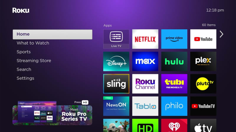
For most of its existence, the Roku app grid has run three columns wide, a claustrophobic setup made necessary by the giant banner ad Roku runs along the right side of the screen.
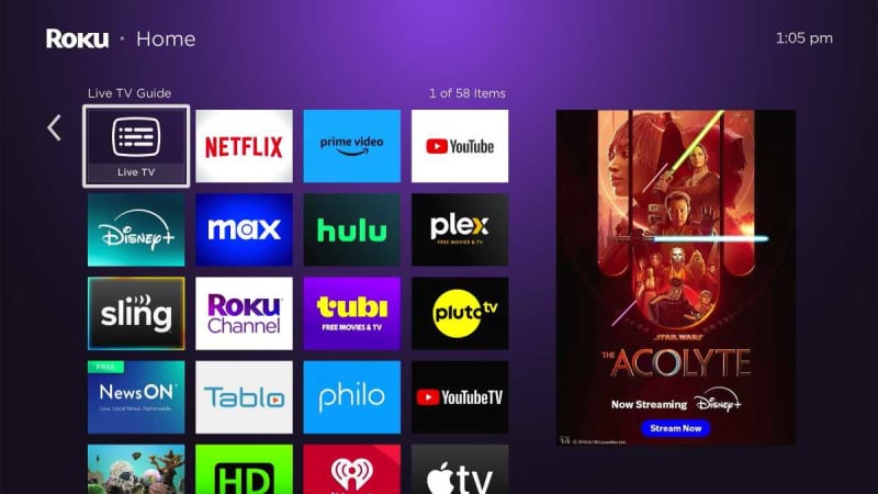
With the launch of Roku OS 12 last fall, Roku added an option for a four-wide grid that uses smaller icons. (Naturally, the banner ad remains the same size.) Roku briefly experimented with making it the default, but it drew complaints from visually impaired users and it is now an optional feature instead. Unless you have trouble seeing the smaller icons, it is a vast improvement in usability.
Jared Newman / Foundry
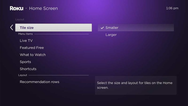
The fix: To enable the expanded icon view, head to Settings > Home Screen > Tile Size, then select “Smaller.” You can always change back by returning to this menu and selecting “Larger.”
Step 2: Hide the “What’s Streaming” row
Jared Newman / Foundry
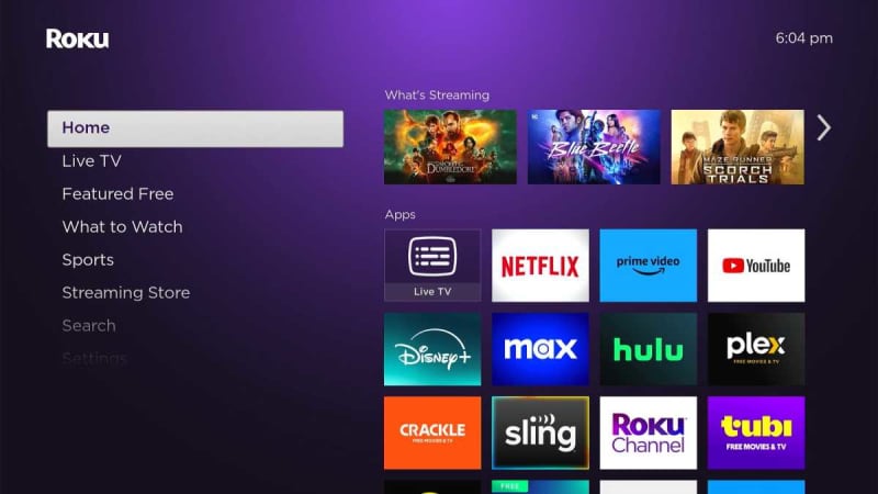
In a more recent change to the Roku app grid, you may now see a row of “What’s Streaming” recommendations at the top.
While I’m all for a more content-forward Roku interface, these recommendations are mostly worthless. You only get three of them, so the odds that they’ll be of interest is small, and you can’t see where they’re available to stream without clicking through on each one. They mostly just come off as an intrusion on what had been a sacrosanct section of the Roku home screen.
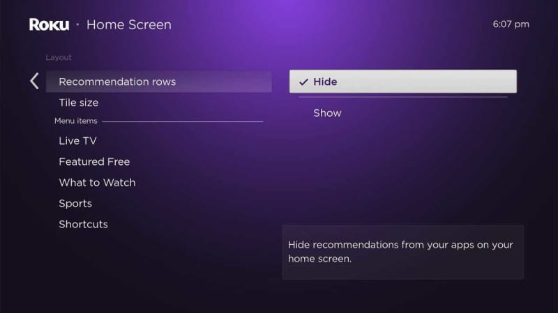
Jared Newman / Foundry
The fix: To get rid of those unsightly tiles, head to Settings > Home Screen > Recommendation Row, then select “Hide.”
Step 3: Get rid of shortcuts
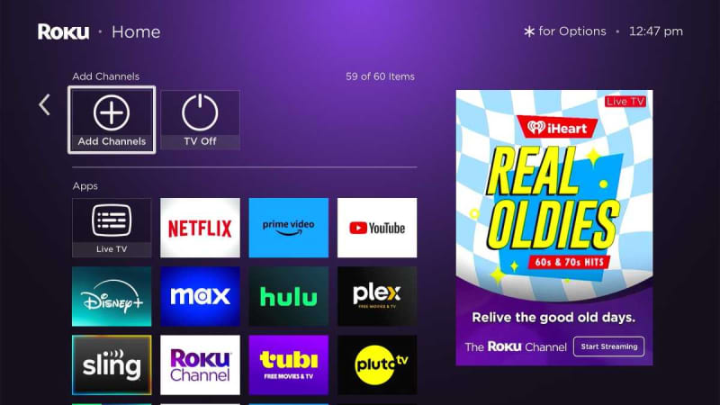
Jared Newman / Foundry
Back in 2019, Roku added a “Shortcuts” section to the app grid, intended to make certain popular actions easier to access. Five years later, that section still consists of just two actions on Roku’s streaming players, both of questionable utility:
- “Add channels” is a shortcut to Roku’s Streaming Store section, which you can just as easily access through the left sidebar.
- “TV Off” triggers an HDMI-CEC command to power down the TV. It’s the same as pressing the power button on most Roku remotes.
You may find “TV Off” useful on the cheapest Roku players, which don’t have a power button. Roku TVs also have a “Sleep Timer” function in the shortcuts section, which some folks may find useful. Still, most Roku users should just wipe away all this clutter, so you can see all your apps without as much scrolling.
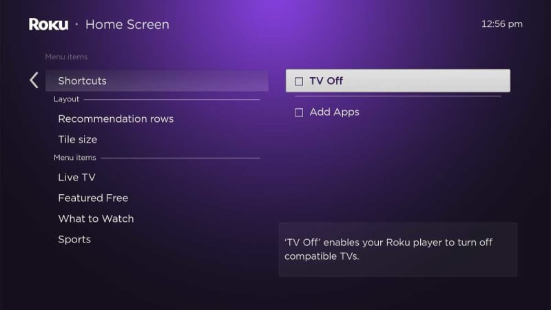
Jared Newman / Foundry
The fix: Head to Settings > Home Screen > Shortcuts, then uncheck everything. This will remove the entire Shortcuts section from the app grid.
Step 4: Remove some home screen sections
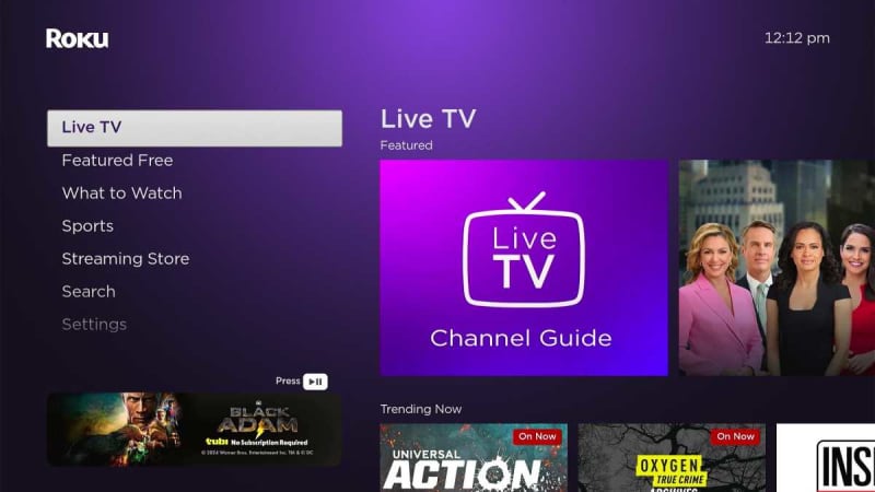
Jared Newman / Foundry
In addition to the usual banner ads on the right-hand side of the app grid, you may have started seeing a new ad just below the left sidebar menu. Beyond just making Roku’s interface look tackier, this new ad also shrinks the available space for navigation, so certain menu items may be hidden without additional scrolling.
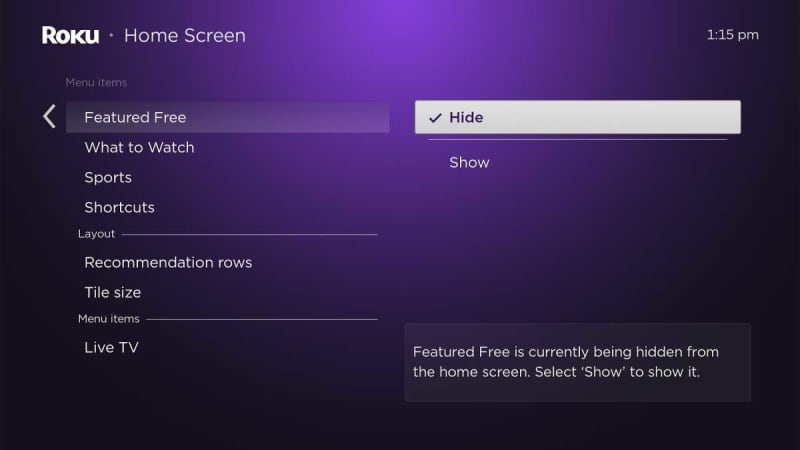
While you can’t hide the new ad and reclaim that space, you can at least streamline the sidebar by clearing out superfluous menu items. I suggest hiding the Live TV and Featured Free tiles in particular. You can still access Roku’s live channel guide through a tile in the Home menu, and and the Featured Free section is redundant given how much free content appears in the separate What to Watch menu.
Jared Newman / Foundry
The fix: Head back to Settings > Home Screen, then look under the “Menu Items” header. From here you can show or hide the Live TV, Featured Free, What to Watch, and Sports menus. Even just hiding one of these sections is enough to keep the entire sidebar visible.
If you’re using one of Roku’s lower-end streaming devices, you’ll find that replacing its remote with the all-new Roku Voice Remote Pro (2nd edition) to be a significant upgrade. Read our in-depth review at the preceding link.
For more streaming TV advice, sign up for Jared’s Cord Cutter Weekly newsletter.