The abominable red colouring on the new West Ham United kits can be explained amid criticism from Hammers fans.
West Ham are set to launch their new kits in the coming weeks and there’s already controversy over them.
Many Hammers fans have wanted to see the club to part ways with Umbro and sign up with a different kit manufacturer.
And they’ve been given more ammunition as to why in the last few days.
Earlier this month the alleged new West Ham home shirt was leaked online, emblazoned with Umbro’s stitched logo featuring a bright red diamond along with a the logo repeated across the kit.
West Ham fans red with anger
The red in particular stuck out like a sore thumb and was heavily criticised by West Ham fans.
Many believed the red diamond in the Umbro logo was a sign the “leak” was a fake West Ham kit.
But yesterday West Ham’s new black away shirt was not only leaked but confirmed by a club insider too.
It too features the Umbro logo with a bright red diamond – which many feel clashes awfully with West Ham’s traditional claret.
The black away strip also features the church of the famous Bow Bells.
The Hammers have no history of having red on their kits. Claret yes. But not Liverpool red like this. So fans have understandably been left perplexed.
Now the abominable red colouring on the new West Ham kits is explained amid fan criticism.
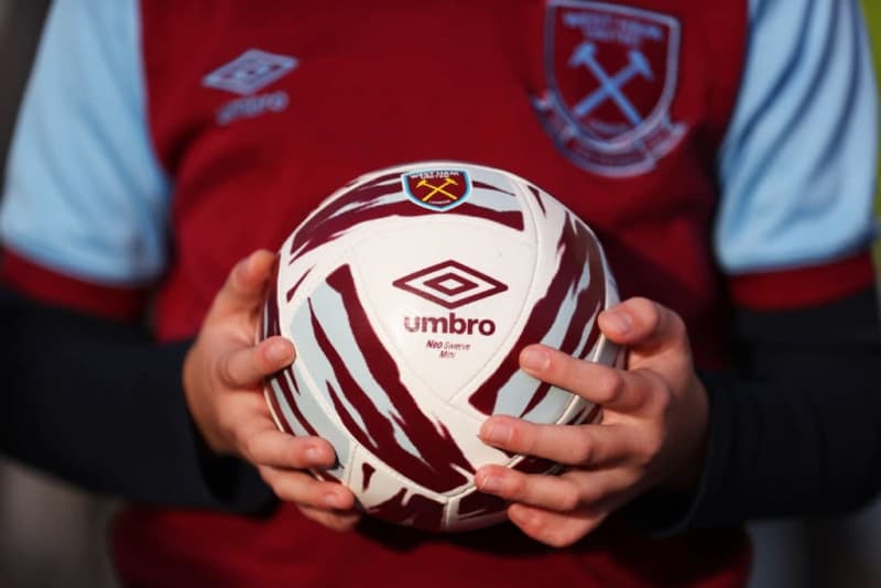
Abominable red colouring on new West Ham kits explained
It all stems from the British brand celebrating a significant milestone.
You see Umbro turned 100 last month – on May 23rd to be precise. And West Ham’s kit maker has decided to mark the occasion with a new centenary logo that ‘celebrates its legacy’.
For it’s anniversary, Umbro has introduced a new logo variant that adds the bold red colour to the central diamond.
Creative Bloq say it is to “capture attention and draw the eye”.
Well it certainly does that. And for all the wrong reasons as far as most West Ham fans on social media, fan forums and Hammers chat groups seem to be concerned.
So the red diamond will be present on all Umbro kits this season.
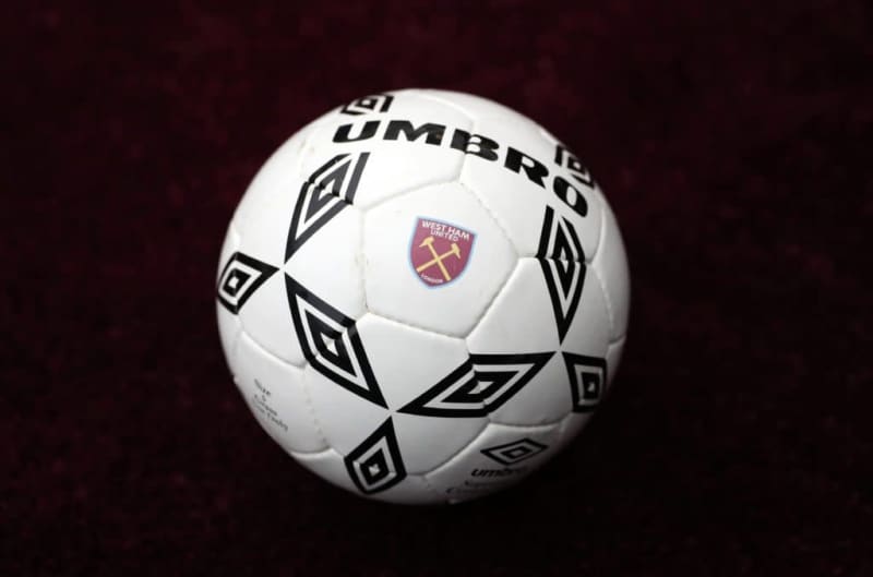
Umbro made West Ham’s first ever replica kits and replaced fans’ favourites Adidas.
But they are not doing their standing among Hammers supporters much good with this.
West Ham’s orange and white third kit from the season before last was reviled by many fans when it was released.
But the Hammers ended up making that kit somewhat iconic when the Hammers won their first major trophy for 43 years 12 months ago.
Another questionable Umbro release
Hammers News previously reported on claims that the club were set to remain with Umbro in a deal worth over £7m per season.
In fairness Umbro have come up with some decent efforts over the years. But too many have been poor efforts.
Many of the third strips they produce are also poorly thought out in terms of colours and style meaning they end up barely being worn by the team due to clashes with the opposition.
For those wondering about the significance of the Church of St Mary-le-Bow imprinted in the background of the new away shirt, it is cockney history.
Last word to West Ham insider Sean Whetstone to explain.
“West Ham’s 2024/25 away shirt includes a imprinted image of St Mary-le-Bow Church,” Whetstone said.
“Bow Bells Church is in Cheapside east of the city of London.
“The image appears within the black material as a nod to cockneys.
“Traditionally, anyone born within earshot of the Bow Bells was considered to be a true Cockney.
“Stratford is one area traditionally on the outskirts of that area where the bells could once be heard around 1900.”
Do you agree with the list of the best West Ham kits of all time below?