Plans for new signs at an opticians have been met with opposition - with critics saying they are so “in your face” that eye tests could be held on the street.
The plans, for Pinders Opticians on Queen Street, were discussed by Southwell Town Council at its planning and highways committee meeting on Wednesday, April 3.
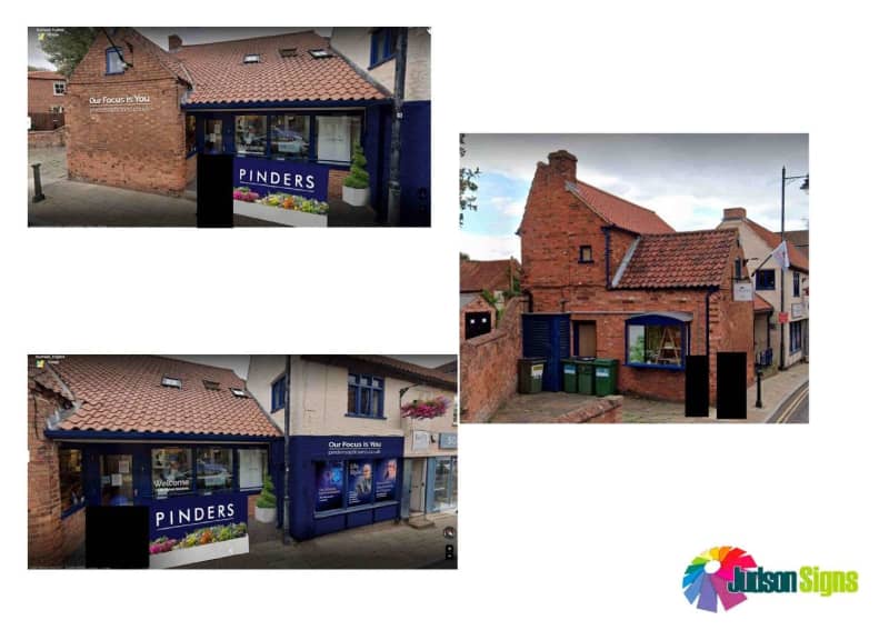
The plans proposed a dark blue panel with large white lettering reading ‘PINDERS’, to be attached to the existing handrail by the entrance to the building.
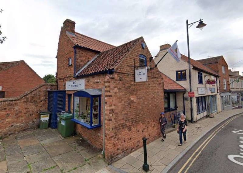
Two further signs are planned on the western side of the building, one on the higher wall reading ‘PINDERS’ in white acrylic lettering and a lower sign above the bay window reading ‘Our focus is you’ and ‘pindersopticians.co.uk’ which would replace an existing wooden sign.
At the front of the building, a replacement hanging sign and another sign reading ‘Our focus is you’ and ‘pindersopticians.co.uk’ are planned for the brick gable end and another sign reading the same is planned for the white rendered part of the building, to replace the aging wooden sign.
The opticians’ design statement suggested that the current signs are misleading and are in disrepair, “adversely affecting the business and the Southwell shopping area”.
Committee chairman Jeremy Berridge described the plans as “a tad over ambitious” and “a bit too strong in the front”, and suggested it felt like an eye test when looking at it.
Malcolm Brock added: “I don’t like it. I think it is in your face.
“The banner on the railing is totally inappropriate.”
Roger Blaney echoed the sentiment and said the banner sign was “unacceptable”, and the council should support the civic society’s comments.
Southwell Civic Society suggested the plans were not in keeping with the town and strongly opposed to the banner sign.
It stated: “ “It is too large, too bright and uses unsuitable materials. It is totally an inappropriate place for a sign.
“We would question the necessity for such dominant signage for a professional facility.”
Gina Adams questioned if there was any precedent of banner signs along the two main shopping streets in the town — which there is not — and shared concerns it could have a knock on effect and completely change the look of the high street.
Councillors raised no issue with the other signs planned for the building, but unanimously objected to the banner sign.
What do you think? Tell us your views in the comments below…